
Customizing
A refined chart tells the reader what to pay attention to. That can be done with a clear title or description, highlighting, labels and more.
Use the manual settings, or the prompt, to tell a story with your data.
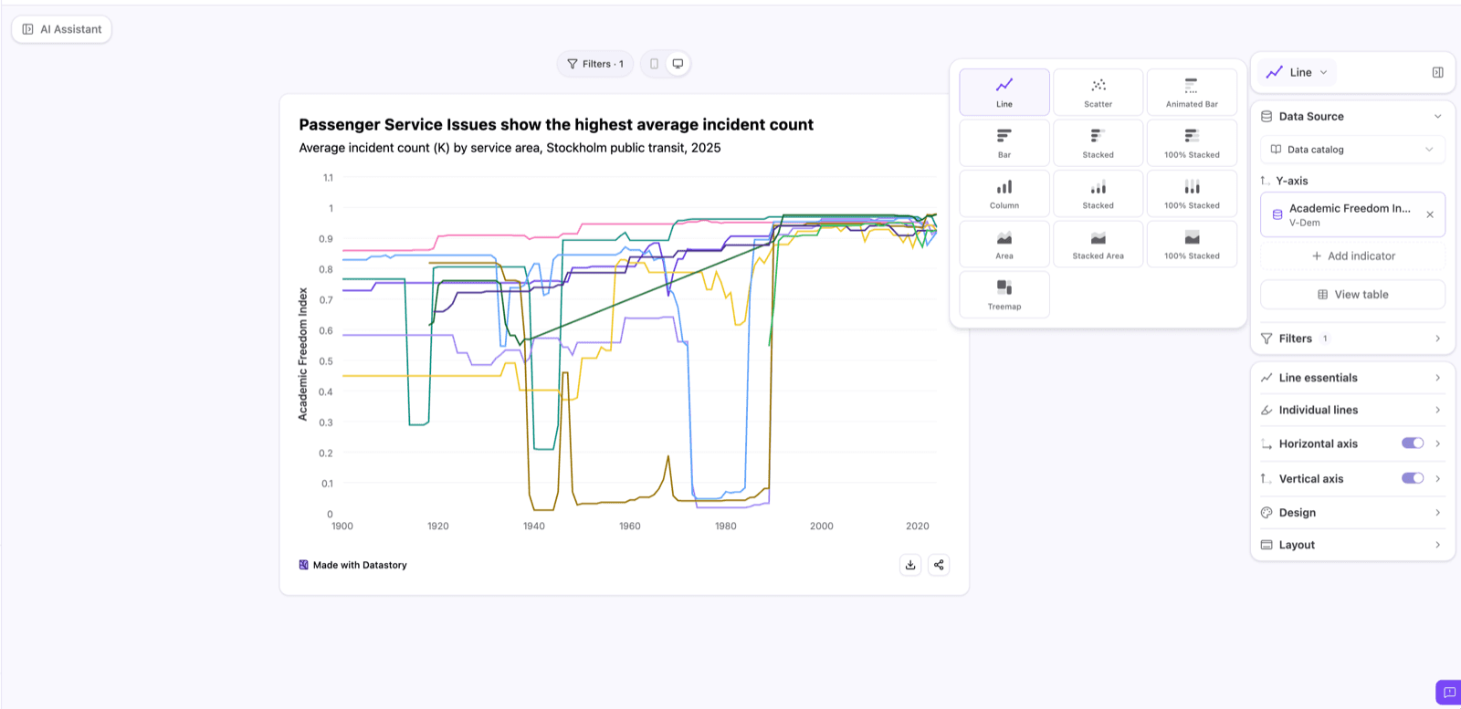
Change the chart type
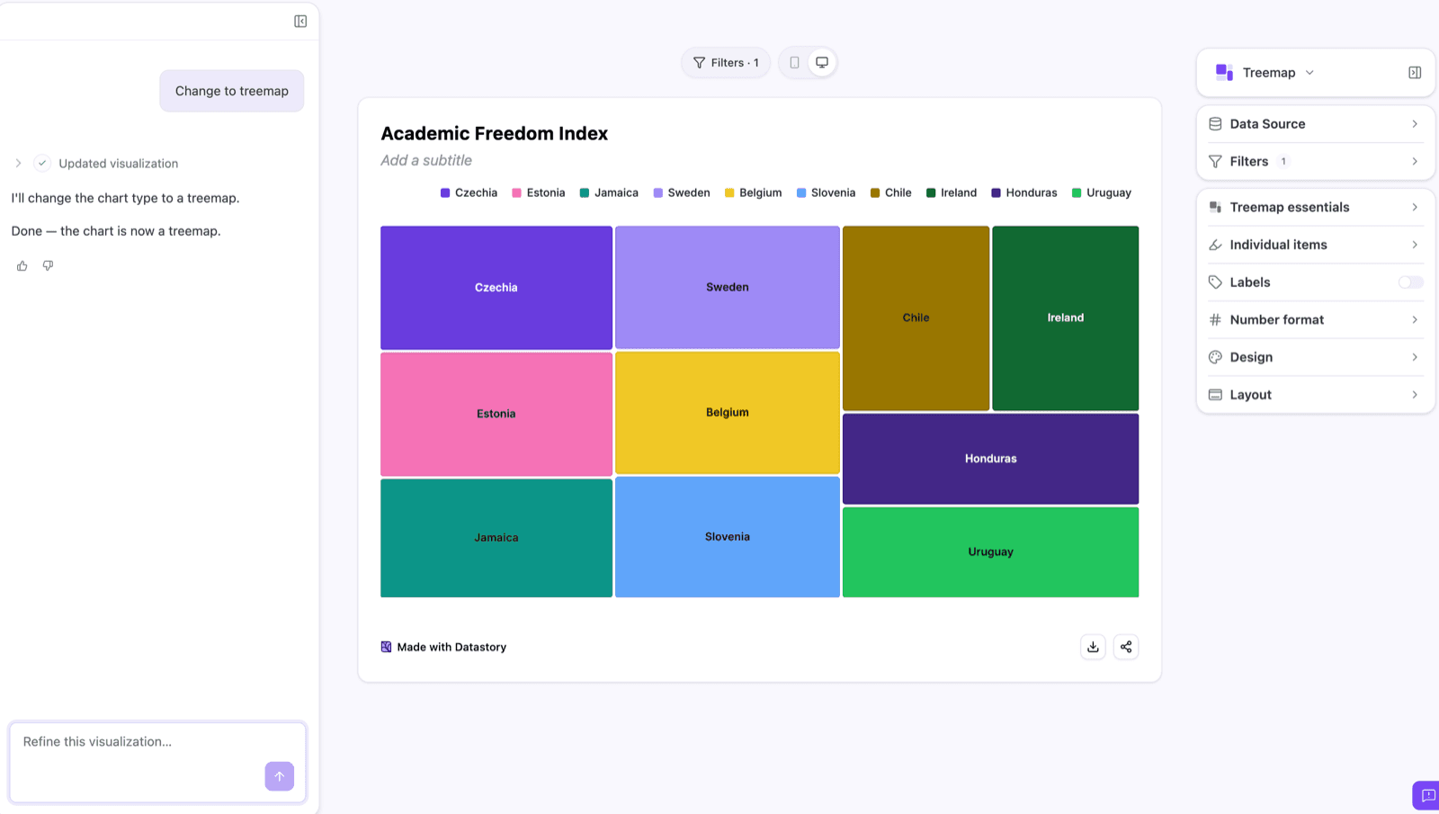
The chart type switcher sits at the top of the settings panel. You can also use a prompt like “Change to area chart.” Switching types doesn’t mean rebuilding: your data source and indicator carry over, so you can test different options before settling on what fits your data best.
A few rules of thumb:
- Line for change over time, especially with many series. It’s the default for a reason: trends read faster as slopes than as bars.
- Bar or column for comparison at a single point in time, or when category labels matter more than trend.
- Stacked or 100% stacked when the parts of a whole matter as much as the total.
- Scatterplot for the relationship between two variables, to reveal correlation, clusters, or outliers across many points.
- Animated bar when the change over time is the story you want the reader to feel as it unfolds.
- Treemap for hierarchical or proportional data with too many categories for a bar chart to hold.
Filter the data
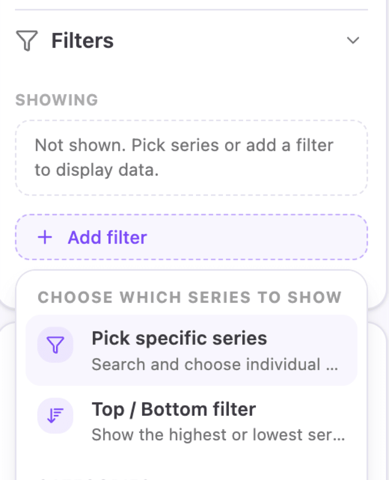
In the filters panel, filter by presets like Top 10, or by any category or dimension available in your dataset, such as gender or age.
Click Add filter to see all available filters for your dataset.
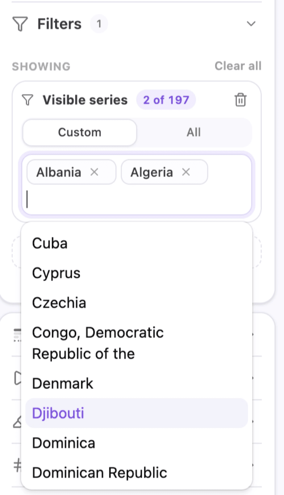
To select specific series, click on Pick specific series, Custom and use the dropdown to add or remove series displayed on your chart. To show all available series, click All.
Filter time
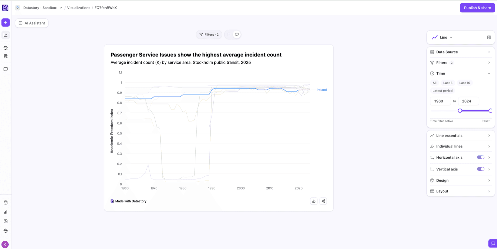
Most datasets span many years and you rarely want to show all of them. The time filter lets you choose exactly which period of time appears in your chart.
Open the time filter and either pick a preset or set your own range:
- Presets like Last 5, Last 10, or latest period jump straight to the most recent years, handy for keeping a chart current.
- Custom range lets you set an exact from and to year, either by typing them or dragging the slider.
You can do the same by prompt, for example “show the last 10 years” or “filter to 2008–2023.”
Highlight
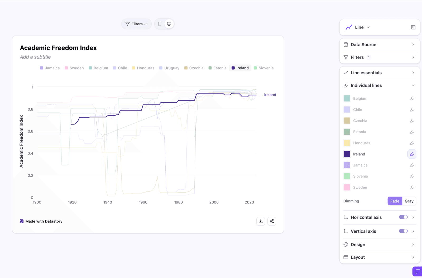
In individual lines, bars, points or sections, select the series you want to draw attention to by clicking on the pen.
Two dimming modes are available:
- Fade softens the non-highlighted lines, bars, points or sections while keeping them visible, useful when the surrounding context still matters.
- Gray removes color entirely from everything but the highlighted lines, bars, points or sections, which is useful when the comparison is the entire point.
Axes
The Axes panels control how the vertical and horizontal axes are displayed. Each axis can be toggled on or off, and expanded to fine-tune the details. You can also adjust axes with a prompt, like “start the axis at zero” or “add a % suffix.”
Vertical axis
- Axis title is useful when the unit isn’t obvious from the chart or leave off to save space.
- Gridlines are the light reference lines behind the chart. Keep them on to help readers estimate values, or turn them off for a cleaner look.
- Start from zero is set by default for most charts. Turn it off only when small differences matter more than absolute size, and be aware it can exaggerate change.
- Decimal places can usually be left on auto, or set a fixed number to keep values tidy (e.g. 0 for whole numbers).
- Unit (suffix) is used to add a unit that appears after each value, like %, kr, or USD.
Horizontal axis
The same controls apply, so you can show or hide the axis title and gridlines to match the vertical axis and keep the chart balanced.
Layout
The layout panel controls what appears in three parts of your chart: the header, the container, and the footer. Toggle each element on or off depending on where the chart will live.
Header
Turn off the title or description when the chart is embedded somewhere that already has its own headline, like a report or article, so you’re not repeating it. Add a logo to show your organization’s branding.
Container
The border and padding separate the chart from the page around it. Turn them off when you’re placing the chart inside a layout that already has its own framing, so you don’t end up with a border inside a border.
Footer
- Source is the one field to almost never turn off. It adds credibility and makes your chart citable when shared.
- Add metadata for structured details like the last-updated date.
- Add empty field for anything else worth noting, like methodology or a comment.
- Download and share apply to what you want shown on your published chart. They can be turned off when you want to limit how the chart is distributed or keep them on so your audience can download, share and embed.
- Datastory watermark is the Made with Datastory branding. It can be removed on the Professional plan.