Create interactive data visualizations online
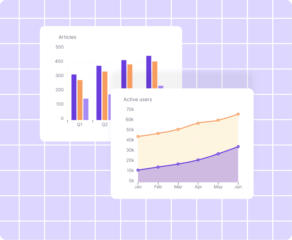
Turn your data into clear, interactive visualizations with Datastory. Start for free, upload your data or use open datasets, customise your visual, and publish or embed it in minutes.
Free forever · No credit card · Publish anywhere.
Why Datastory is right for you
Designed for data storytellers, analysts, journalists, NGOs, and research teams who communicate insights through clear data visualization.
💸
Always free to use
Nothing to install and no account required.
< >
No-code needed
Create powerful visuals without writing a single line of code.
🎨
Adaptable to your brand
Apply your fonts, colors, and styles effortlessly.
📖
Built for storytelling
Turn charts into clear, compelling narratives.
This is one of the most beautiful ways of showing the Global State of Democracy findings that I have ever seen. It was a pleasure to work with Datastory, who went above and beyond to create this site for us.
Seema Shah
Democracy Assessment Head at International IDEA
📊
Access Open data
Access our curated database of open public data
🌐
Mode for the web
Fast, responsive visuals that work everywhere.
Choose a visualization type
Select the format that best fits your data and what you want to show.
Tools for storytellers
Each tool helps transform data into publishable stories, with support for structure, context, and clarity at every step.
Each tool helps transform data into publishable stories, with support for structure, context, and clarity at every step.


Turn your data into stories people understand
Data visualizations transform raw numbers into insights you can actually understand and act on. From charts and graphs to dashboards and stories, data viz helps you explore patterns, compare values, and communicate complex information clearly and effectively.
With Datastory, you go beyond static visuals. You can interact with your data, filter and explore different views, drill into details, and guide viewers through insights step by step, turning raw datasets into clear, engaging data stories.
Join waitlistStill have questions?
Get quick answers to the most common questions about our platform.
Data visualization is the visual representation of data that helps people understand patterns, trends, and differences more easily.
Yes. Datastory offers a generous free tier for creating and publishing interactive visualizations.
No. Datastory is designed to work without coding.
Yes. Visualizations created with Datastory can be embedded in articles, reports, and other web pages.
If you can't find what you're looking for, just email us
Turn your data into clear, interactive stories
Join journalists, analysts, and teams in turning complex data into clear, meaningful stories with Datastory.
Join waitlistGenerous free tier
Access open data
No coding required
Resources
©2026 Datastory All rights reserved.