Free visualization
Make interactive bar charts for free
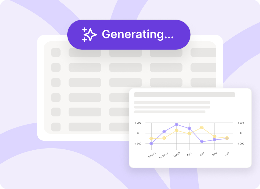
Build interactive data stories without code. Upload your data, customize your visual, and publish or embed it in minutes.
No credit card needed.
Why Datastory is right for you
Designed for data storytellers, analysts, journalists, NGOs, and research teams who communicate insights through clear data visualization.
💸
Always free to use
Nothing to install and no account required.
< >
No-code needed
Create powerful visuals without writing a single line of code.
🎨
Adaptable to your brand
Apply your fonts, colors, and styles effortlessly.
📖
Built for storytelling
Turn charts into clear, compelling narratives.
This is one of the most beautiful ways of showing the Global State of Democracy findings that I have ever seen. It was a pleasure to work with Datastory, who went above and beyond to create this site for us.
Seema Shah
Democracy Assessment Head at International IDEA
📊
Access Open data
Access our curated database of open public data
🌐
Mode for the web
Fast, responsive visuals that work everywhere.
Visualize your data with interactive bar charts
Bar charts are one of the simplest and most effective ways to compare values across categories. They're ideal for visualizing categorical data such as sales by product, population by country, survey responses, or performance by team.
With Datastory, you go beyond static visuals. You can interact with your data, filter values, drill into details, and guide viewers through insights, turning charts into clear, engaging stories instead of flat images.
Join waitlistTools for storytellers
Each tool helps transform data into publishable stories, with support for structure, context, and clarity at every step.
Each tool helps transform data into publishable stories, with support for structure, context, and clarity at every step.


Related charts and graphs
Explore other chart types to find the perfect visualization for your data.
Still have questions?
Get quick answers to the most common questions about bar charts.
Yes. Datastory offers a free tier that lets you create and publish interactive bar charts online using your own data or open datasets.
No. Datastory is a self-serve tool designed to work without coding.
Yes. Bar charts created with Datastory can be embedded in articles, reports, and other web pages.
If you can't find what you're looking for, just email us
Ready to create bar charts?
Start creating beautiful, interactive visualizations today. Free forever, no credit card required.
Join waitlistResources
©2026 Datastory All rights reserved.