
Public sector
Turn public data into informed citizenry
Datastory helps agencies and institutions publish their statistics and results as interactive charts, maps and stories that citizens, journalists and elected officials can understand. No web developer, no procurement.
The opportunity
Build public trust and an informed citizenry through data storytelling
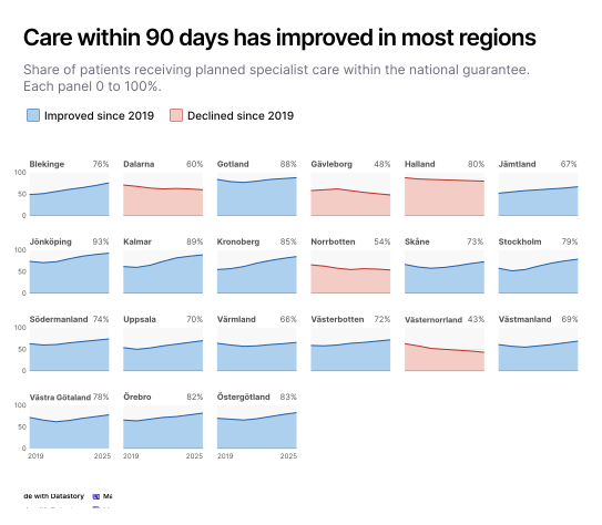
Public bodies publish enormous amounts of data: waiting times, emissions, school results, spending, permit decisions. Most of it lands as a PDF annual report or a CSV on an open data portal, where only specialists go looking. Datastory turns those figures into pages that citizens and journalists read, understand and come back to.

Earn trust by being understood
Publishing a dataset and getting it understood are two different things. Trust grows when a citizen can see the figure and understand what it means for them, without needing a background in statistics.

Make complex issues clear
We process images much faster than raw text or data tables. A chart lets someone see how a trend developed or how their region compares in seconds.

Become the source people cite
Figures that are easy to read and easy to embed get picked up. Journalists quote them, teachers bring them into classrooms, and other agencies build on them.

Let people explore the data
Interactive charts let people filter to their own municipality, school or hospital and find what applies to them. A national average tells a resident very little about the queue at their own clinic.
Use cases
Data communication solutions designed for public sector needs
Four capabilities that take you from a dataset to a published story citizens understand and journalists cite.

Data visualization
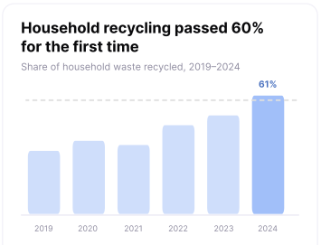
Publish visualizations everyone can understand
Turn statistics into charts a citizen can read without a background in statistics. Publish once and embed the same figure in your site, a press release or a report.

Open Data Catalog
Add more context to your data
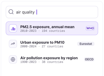
A national figure means more when a reader can see it next to a global one. Eurostat, OECD and WHO datasets are already in the platform, so you can show how your country or region compares without collecting and cleaning the data yourself.

AI & Insights
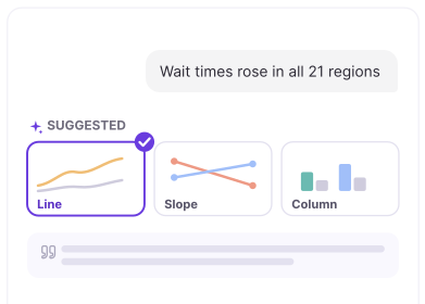
Discover the best way to present your data
Describe what the statistics show and get recommendations for chart types, captions and annotations. The AI handles presentation. The wording and the interpretation stay with you, and nothing goes out before you approve it.

Linked data
Update data across projects effortlessly
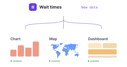
The quarterly release lands. Upload the new figures in one place, and every chart, map and dashboard using that data updates at the same moment.
The Datastory workflow
Most tools stop at the visual. We don't.
Datastory is the only platform that takes you from raw, messy data all the way to a published narrative. Create charts that tell a story instead of just showing stats.
01
Connect data
Pull data from spreadsheets, your own linked data or quality metrics from our Open Data Catalog.

02
Shape your story
Collaborate with AI to identify the most interesting insights and the best way to visualize them.

03
Refine details
Edit captions, add annotations and tweak colors to make your story pop. Ask AI or tweak manually.

04
Publish
Publish as a standalone link, embed in websites or export as a high-quality image. Ready for any channel.

Ready to transform your data into stories?
Join data journalists, researchers, and analysts creating compelling visualizations that inform, engage, and drive action.