
Nonprofits
Turn data into stories that inspire action
Datastory helps mission-driven teams turn data into interactive charts, maps and stories that can be published to your site and social channels. No data team, no design agency.
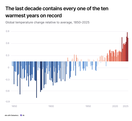
The opportunity
Create awareness, engagement and action through data storytelling
Nonprofits hold data that could change how people see an issue: species in decline, the effectiveness of different policies, inequality that's widening. But it usually stays locked in spreadsheets and PDFs. Datastory turns it into stories the public actually reads, shares and remembers.

Change minds with evidence
Statistics have the power to cut through uncertainty and cause people to genuinely reevaluate their opinions, especially when paired with effective storytelling.

Make complex issues clear
The human brain processes images much faster than raw text or data tables, helping people spot trends and comprehend information instantly.

Publish charts made for sharing
Good charts work just as well in a report as on their own, which matters when someone shares it on social media or a journalist embeds it in an article.

Let people explore the data
Interactive charts let readers filter by country, year, or category and look up the cases they care about. People spend longer with a chart they can explore than with a static image.
Use cases
Data communication solutions designed for nonprofit needs
Four capabilities that take you from a dataset to a published story your audience engages with and shares.
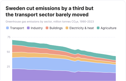

Data visualization
Get your message across in seconds with captivating visuals
Annotate the turning point. Animate the decline. Build a map where a reader finds their own region and understands immediately why this matters to them.


Open Data Catalog
Access quality data to support your mission
Tracking down the right statistic from the OECD, WHO, or a national statistics agency takes time. In Datastory, those datasets are already in the platform, ready to be visualized.
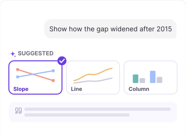

AI & Insights
Find the strongest story in your data
Describe the point you want to make and get recommendations for the most appropriate chart types, along with relevant captions and annotations.
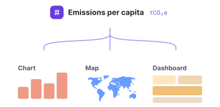

Linked data
Upload data once, use it everywhere
Define a metric once and it stays consistent across your whole workspace, ready to be used in any chart, map or dashboard.
The Datastory workflow
Most tools stop at the visual. We don't.
Datastory is the only platform that takes you from raw, messy data all the way to a published narrative. Create charts that tell a story instead of just showing stats.
01
Connect data
Pull data from spreadsheets, your own linked data or quality metrics from our Open Data Catalog.

02
Shape your story
Collaborate with AI to identify the most interesting insights and the best way to visualize them.

03
Refine details
Edit captions, add annotations and tweak colors to make your story pop. Ask AI or tweak manually.

04
Publish
Publish as a standalone link, embed in websites or export as a high-quality image. Ready for any channel.

Ready to transform your data into stories?
Join data journalists, researchers, and analysts creating compelling visualizations that inform, engage, and drive action.