
Newsrooms
Make quality graphics at lightning speed
Datastory helps reporters and editors build interactive charts, maps and stories that publish straight into an article, a newsletter or a social feed. No graphics desk queue, no developer.
The opportunity
Stop the scroll and earn trust through data storytelling
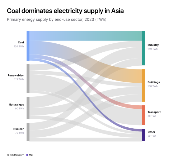
Numbers carry the weight of a story, but they can also be where readers drop off. A paragraph just listing stats gets skimmed. The same figures presented as a chart get looked at, understood and shared. Datastory helps your newsroom publish graphics that hold attention and show readers the evidence behind the reporting.

Show readers the evidence
Readers are quicker to believe a claim when they can see what it rests on. A chart with its source named and the underlying figures a click away turns an assertion into something the reader can check.

Make complex issues clear
The human brain processes images much faster than raw text or data tables. A chart lets a reader grasp in seconds what a paragraph of percentages takes several rereads to deliver.

Publish to every channel
The same chart works embedded in an article, exported as an image for social, or dropped into a newsletter. Build it once and it travels wherever the story goes.

Give readers a reason to stop
Motion, annotation and interaction earn attention in a feed where everything else is competing for it. A graphic that is interesting on its own gets shared well beyond your own site.
Use cases
Data communication solutions designed for newsroom needs
Four capabilities that take you from a dataset to a published graphic your readers understand and share.

Data visualization
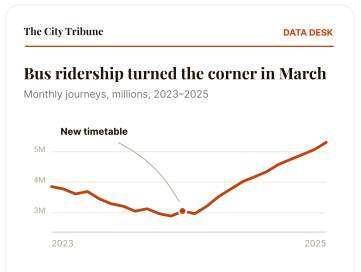
Create stunning, on-brand graphics that capture attention
Annotate the moment the trend turned. Animate a change over time. Apply your own fonts and colors so the chart stays recognizable to your brand wherever it gets shared.

Open Data Catalog
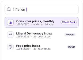
Move faster with built-in datasets
Tracking down the right statistic from Eurostat, the OECD or a national agency can eat an afternoon you do not have. In Datastory those datasets are already in the platform, ready to chart.

AI & Insights
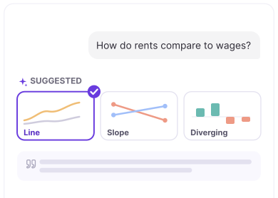
Find the story in the data
Describe what you are reporting and get recommendations for the chart type that makes the point, with captions and annotations to match. Every word stays under editorial control.
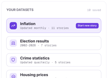

Linked data
Start the next story from the last one
Inflation, election results, crime statistics: the datasets you come back to stay defined in your workspace. The follow-up story starts from a data library you update rather than a spreadsheet you rebuild.
The Datastory workflow
Most tools stop at the visual. We don't.
Datastory is the only platform that takes you from raw, messy data all the way to a published narrative. Create charts that tell a story instead of just showing stats.
01
Connect data
Pull data from spreadsheets, your own linked data or quality metrics from our Open Data Catalog.

02
Shape your story
Collaborate with AI to identify the most interesting insights and the best way to visualize them.

03
Refine details
Edit captions, add annotations and tweak colors to make your story pop. Ask AI or tweak manually.

04
Publish
Publish as a standalone link, embed in websites or export as a high-quality image. Ready for any channel.

Ready to transform your data into stories?
Join data journalists, researchers, and analysts creating compelling visualizations that inform, engage, and drive action.