
Academia and research
Get your findings out of the PDF
Datastory helps research groups publish their findings as interactive charts, maps and stories that journalists, policymakers and the public can actually use. No web developer, no design agency.
The opportunity
Create public understanding and better decisions through data storytelling
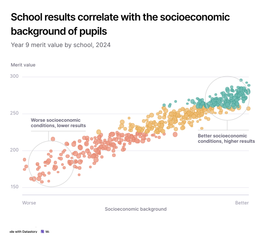
Research groups produce evidence that could settle arguments and change decisions: what a policy actually achieved, how a population is changing, which risks are growing. Most of it ends up as a static figure in a PDF, read by other specialists. Datastory turns those findings into stories that journalists, civil servants and the public can follow.

Reach decision-makers, not only peers
Evidence gets used when a civil servant or a journalist can understand it in a few minutes without reading the methods section. A clear chart with a plain-language caption does that work.

Make complex results clear
We process images much faster than raw text or data tables. A well-built visualization lets a non-specialist see the pattern in your results, including the uncertainty around it.

Publish charts made for sharing
A chart with its own link and embed code can be shared on social media, embedded by a journalist covering your study, or used by a teacher in a classroom.

Let people explore the data
Interactive charts let readers filter by country, year, or category and look up the cases they care about. People spend longer with a chart they can explore than with a static image.
Use cases
Data communication solutions designed for research needs
Four capabilities that take you from a dataset to a published story people outside your field understand.

Data visualization
Get your point across quickly
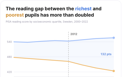
Annotate the year the trend broke. Animate an increasing disparity. Build a map where a reader finds their own municipality and sees what your study found there.

Open Data Catalog
Add more context to your findings
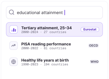
Comparing your results against Eurostat, OECD or WHO figures usually means hunting through agency portals and cleaning downloads. In Datastory those datasets are already in the platform, ready to be visualized next to your own.

AI & Insights
Find the clearest way to present a result
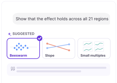
Describe the finding you need to communicate and get recommendations for chart types, captions and annotations. The AI handles presentation. The interpretation stays yours.

Linked data
Upload data once, use it everywhere
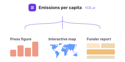
Define a variable once and it stays consistent across your workspace, ready for the project website, the press figure and the funder report. When the next wave of data arrives, you update it in one place.
The Datastory workflow
Most tools stop at the visual. We don't.
Datastory is the only platform that takes you from raw, messy data all the way to a published narrative. Create charts that tell a story instead of just showing stats.
01
Connect data
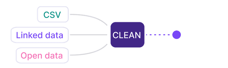
Pull data from spreadsheets, your own linked data or quality metrics from our Open Data Catalog.
02
Shape your story
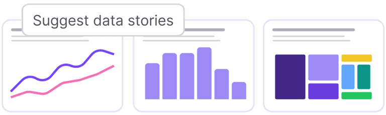
Collaborate with AI to identify the most interesting insights and the best way to visualize them.
03
Refine details
Edit captions, add annotations and tweak colors to make your story pop. Ask AI or tweak manually.

04
Publish
Publish as a standalone link, embed in websites or export as a high-quality image. Ready for any channel.

Ready to transform your data into stories?
Join data journalists, researchers, and analysts creating compelling visualizations that inform, engage, and drive action.