
Marketing and comms
Communication built on your data
Datastory helps communications, marketing and reporting teams publish company data as interactive charts, maps and stories for your website, your social channels, your presentations and your annual report. No data team, no design agency.
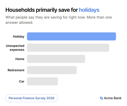
The opportunity
Turn your data into effective communication through storytelling
Businesses publish more data than they get credit for. Annual and sustainability reports, market studies, customer insight, operational figures that say something about the wider economy. Nearly all of it arrives as a PDF, where it gets filed rather than read. Datastory turns those numbers into pages, posts and presentations that customers, investors and journalists take in.

Become a thought leader on your topic
Thought leadership needs something nobody else has, and your own data is exactly that. Original numbers get read, quoted and covered by reporters, and they keep earning attention long after a campaign stops running.

Make complex concepts understandable
Business data usually carries several dimensions at once: size, spread, risk, change over time. A table asks the reader to hold all of them in their head. Animation and annotation let a single chart carry the lot and still be understood at a glance.

Publish to every channel
The same chart works embedded on a website, exported as an animating GIF for social, or as a static image in a report. Build it once and it travels wherever the story goes.

Get more from the reporting you already do
Your annual reporting has the potential to boost brand perception and highlight industry trends, but its potential usually stays untapped in a PDF. The same numbers, published as visual stories, reach the customers, investors and future employees.
Use cases
Data communication solutions designed for marketing and communications teams
Four capabilities that take you from a dataset to published material your market reads, shares and refers back to.
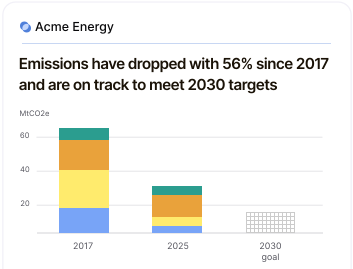

Data visualization
Create stunning, on-brand graphics that capture attention
Annotate the moment the trend turned. Animate a change over time. Apply your own fonts and colors so the chart stays recognizable to your brand wherever it gets shared.
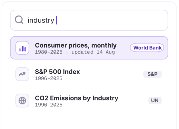

Open Data Catalog
Add more context to your data
Your emissions curve or your market data lands harder beside national and global statistics. Eurostat, OECD and WHO datasets are already in the platform, ready to chart alongside your own.
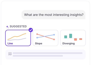

AI & Insights
Find the strongest stories in your data
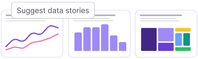
Get recommendations for the strongest stories in your dataset, with captions and annotations to match. Useful when the report contains hundreds of stats and you need to choose what to highlight.
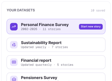

Linked data
Run it again next year without starting from scratch
An annual report or a recurring study builds authority by coming back consistently. Define your metrics once and the next edition is an update rather than a rebuild.
The Datastory workflow
Most tools stop at the visual. We don't.
Datastory is the only platform that takes you from raw, messy data all the way to a published narrative. Create charts that tell a story instead of just showing stats.
01
Connect data
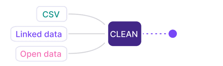
Pull data from spreadsheets, your own linked data or quality metrics from our Open Data Catalog.
02
Shape your story
Collaborate with AI to identify the most interesting insights and the best way to visualize them.
03
Refine details
Edit captions, add annotations and tweak colors to make your story pop. Ask AI or tweak manually.

04
Publish
Publish as a standalone link, embed in websites or export as a high-quality image. Ready for any channel.

Ready to transform your data into stories?
Join data journalists, researchers, and analysts creating compelling visualizations that inform, engage, and drive action.